Written By: Cordellia Yokum- Senior UX Engineer
Is design merely about aesthetics, or does it hold the key to unlocking unparalleled usability and accessibility in digital products? “Good design” isn’t merely about the way something looks; it’s about crafting experiences that seamlessly blend form and function. It’s intuitive, guiding users effortlessly through tasks and interactions without the need for extensive tutorials or explanations. Good design anticipates the needs and preferences of its users, offering solutions that are both efficient and enjoyable. It prioritizes accessibility, ensuring that everyone, regardless of ability or background, can engage with the product comfortably.
Accessibility and usability are all fundamentally about keeping promises and maintaining consistency in user expectations. That means ensuring that elements that visually appear as headings indeed function as such (especially for screen readers), providing clarity and aiding navigation. Similarly, if something looks like a button, it should behave like one, responding to user interactions promptly and reliably. Feedback is crucial; whether it’s a subtle animation or a color change, users should always know when they’ve interacted with an element. Furthermore, good design considers the user at every step, taking into account their needs, preferences, and potential challenges. It avoids making assumptions about user behavior, instead gathering feedback and data to inform iterative improvements.
How we apply these principles at Cephable
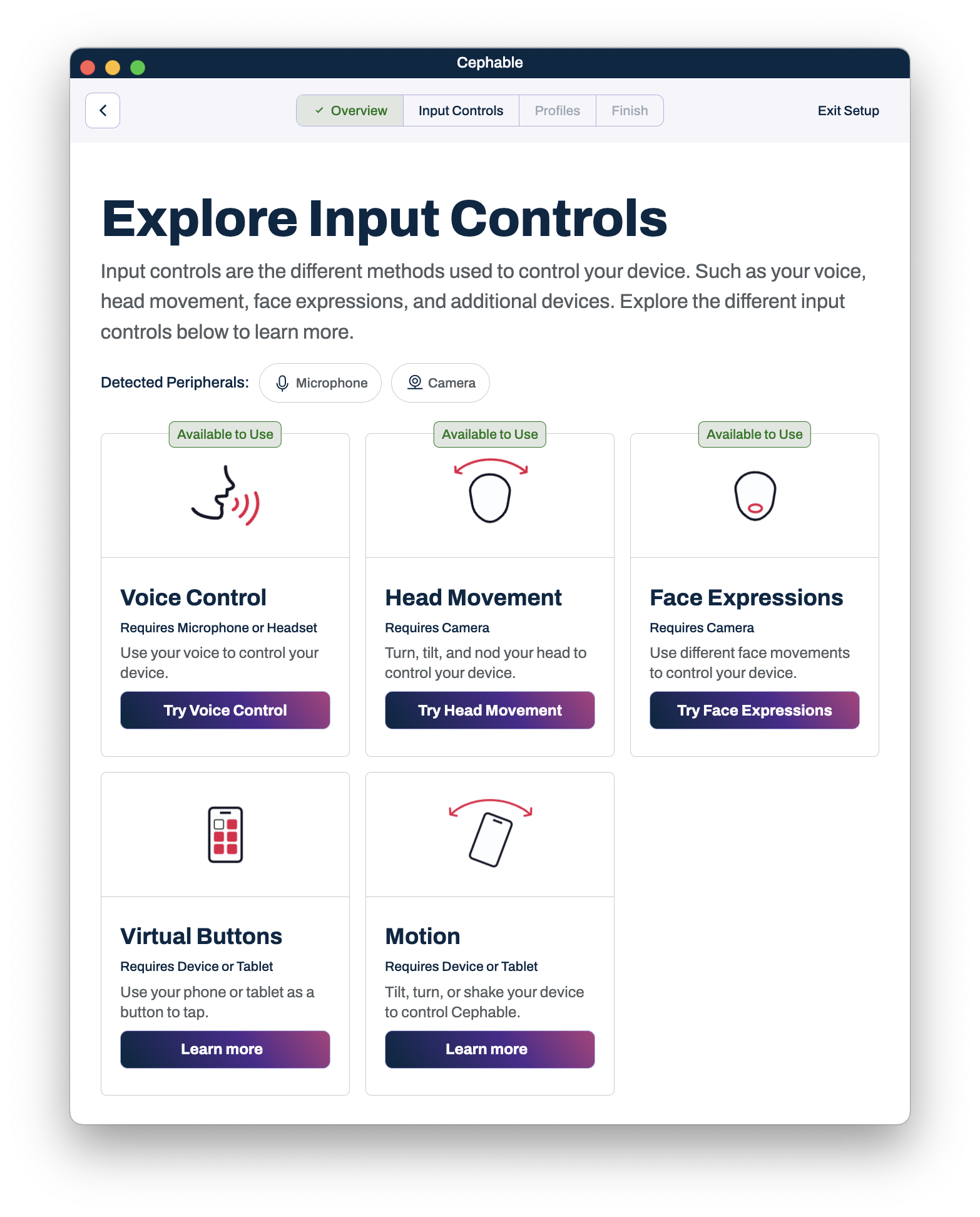
At Cephable, our continued evolution in design underscores a profound commitment to not just enhancing the visual appeal of our applications but fundamentally improving how users interact with our technology. We have restyled the desktop app and implemented a completely new onboarding process to introduce users to the platform. Soon we will be releasing a new mobile app that not only creates more parity with our desktop app but also has a new design (including dark mode). We are so focused on design now not just to make the app prettier; we are taking a hard look because of the close correlation between good design, usability, and accessibility.
We have been working extensively with our consortium members to continuously refine and iterate our design. Good design evolves to better serve its audience, ultimately leading to more intuitive and satisfying experiences.
So how has that been applied to the new designs and onboarding?
– Removing assumptions:
For our new onboarding, we scrapped everything and started from the basics. We investigated the moments that “clicked” for users like their first command that worked. Thanks to the user feedback from our consortium members, we had a pretty solid idea of what these ‘ah-ha’ moments are, and we spent time removing barriers to get there. With the new ‘Try it out’ section, users can try interactions in a safe space, without having to worry about creating profiles, starting controls, or having to go through any additional hurdles.
We also have added in a lot of contextual help – help is needed by more than just first-time users. You can now find support paths, links to step-by-step guides, and callouts to join the community throughout the app. We will continue to evolve particularly in this area by adding even more contextual help within the mobile and desktop apps.

– Minimizing clicks
We hear you, clicking and scrolling is a pain. We have elevated the essentials. We are looking to minimize the number of clicks, scrolling, and general user interactions required once you open the app, this means your first tab stop on the home screen is to start a control! We want you up and using Cephable as quickly as possible, that means starting your controls!
Additionally, we have moved helpful settings out from behind subpages so they are easier to find and quicker to get to.
– User-controlled contrast and motion
At Cephable, we believe in letting you control your technology on your terms, and it’s why we focus on design. The new mobile app will be the first of our products to use dark and light mode. This is an important feature for all users but especially those with eye sensitivity. We are continuing to look at how best we can allow you all to customize more without creating endless settings. Dark mode is a natural place to start since it is based off your OS settings.
We have added a few animations within the apps. This is great for creating dynamic elements that resonate with users but it can also create issues for people with vestibular diseases or motion sensitivity. To balance this we are being thoughtful in ensuring we respect user preferences for animation and motion as well as providing much-needed ways to pause animations.
– Visual and Semantic Hierarchy
A more subtle change throughout our apps is the changes to visual and semantic hierarchy. We are being incredibly thoughtful to ensure that content is grouped together thoughtfully. This also means adding in necessary attributes to ensure this same hierarchy is picked up by screen readers.
– Labeling and Iconography
We have labels! We have context! Particularly in our profile creation, there can be a lot of options. We are working on simplifying these but first and foremost adding thoughtful labels. Expect to see more descriptive explanations of options in coming releases.
We are also excited about our new iconography for controls. These new icons really help some users understand what each control does without having to have all that text!
What’s next for our designs?
We are always working towards a “more good” design that works for our users. We can’t wait for you all to see the new mobile app which will be coming out soon. We are also looking forward to getting dark mode into the desktop app and updating the onboarding for mobile. We always have a slew of top-secret new features we can’t wait to release. However, we never want to lose sight of our community and your feedback. We invite you, as ever, to join our discord, submit your bugs and ideas, or join our consortium.
Subscribe to Our Newsletter
Subscribe to our InkSights newsletter for updates, the latest innovations in AT, community announcements, and more!

